















Buyer's guide
How to choose an architecture template
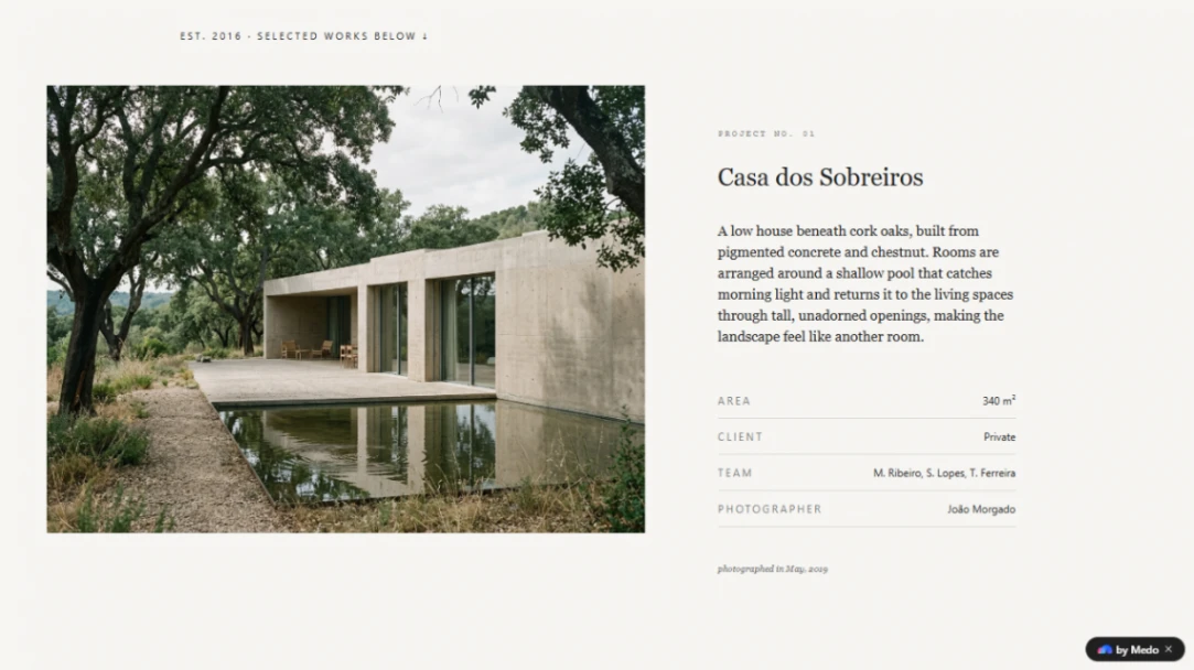
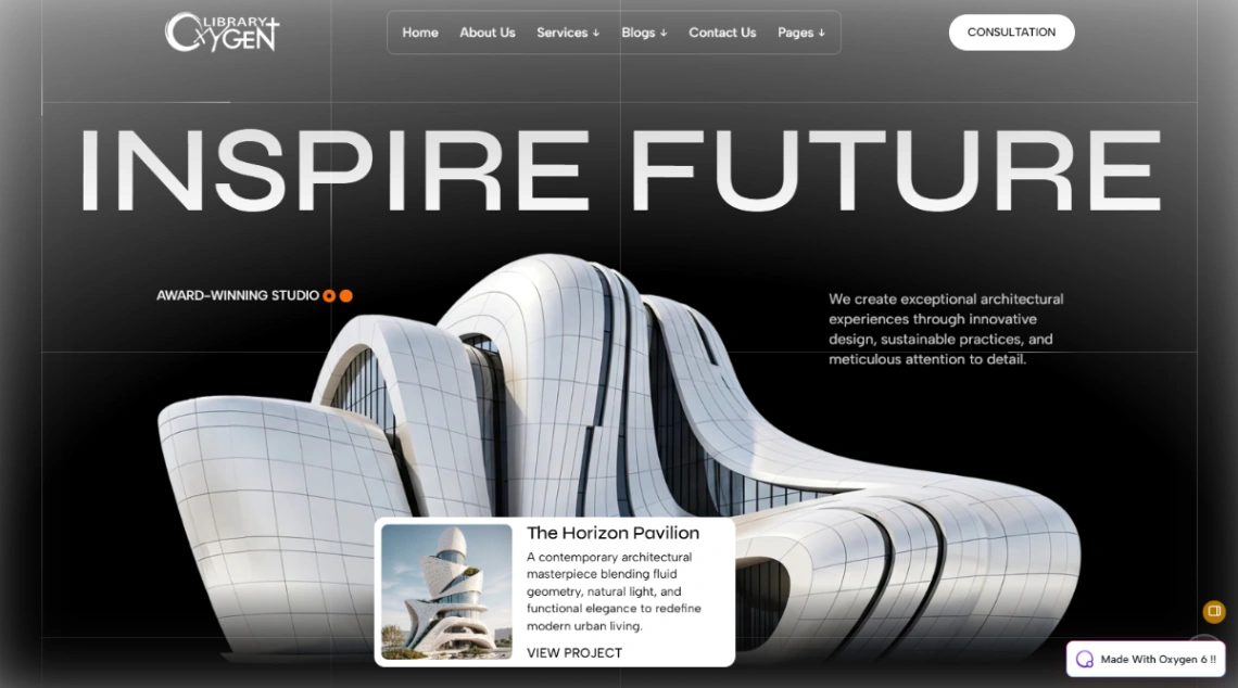
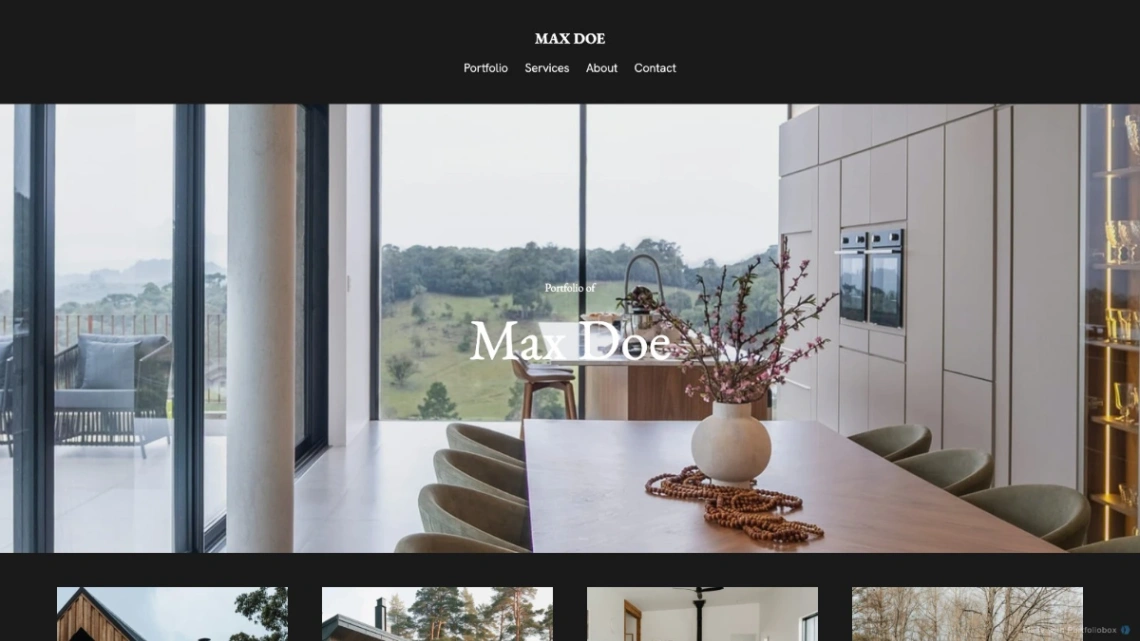
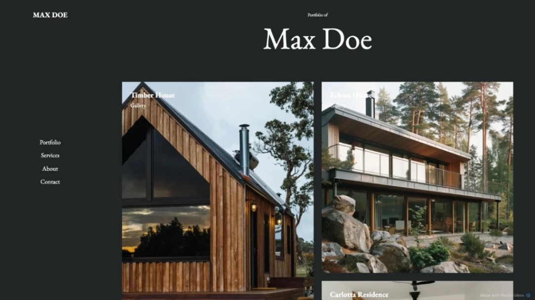
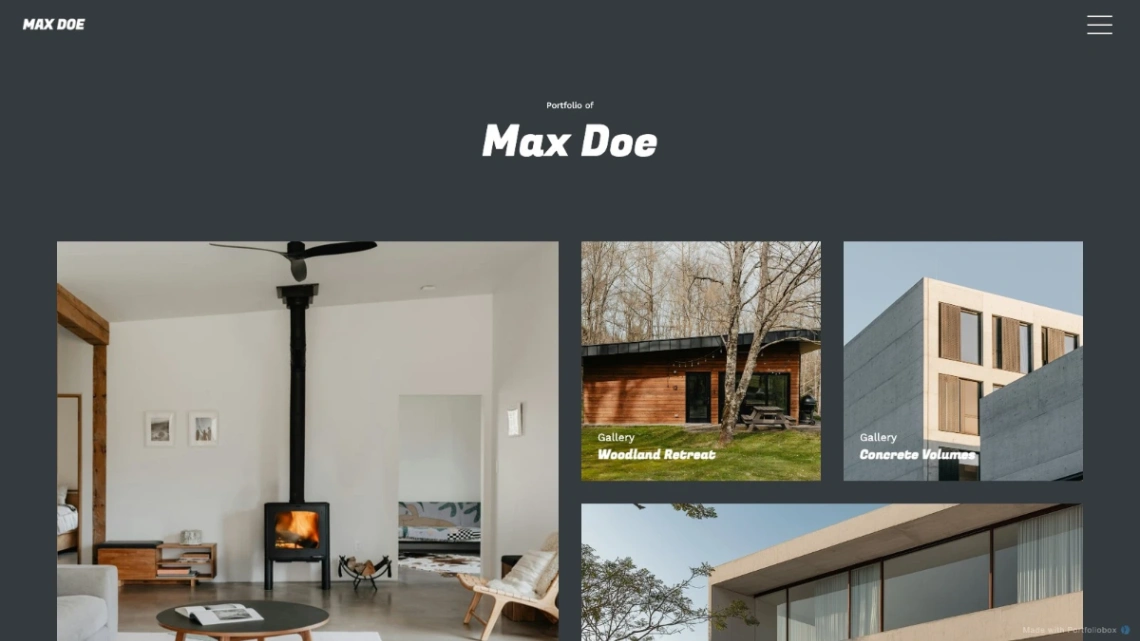
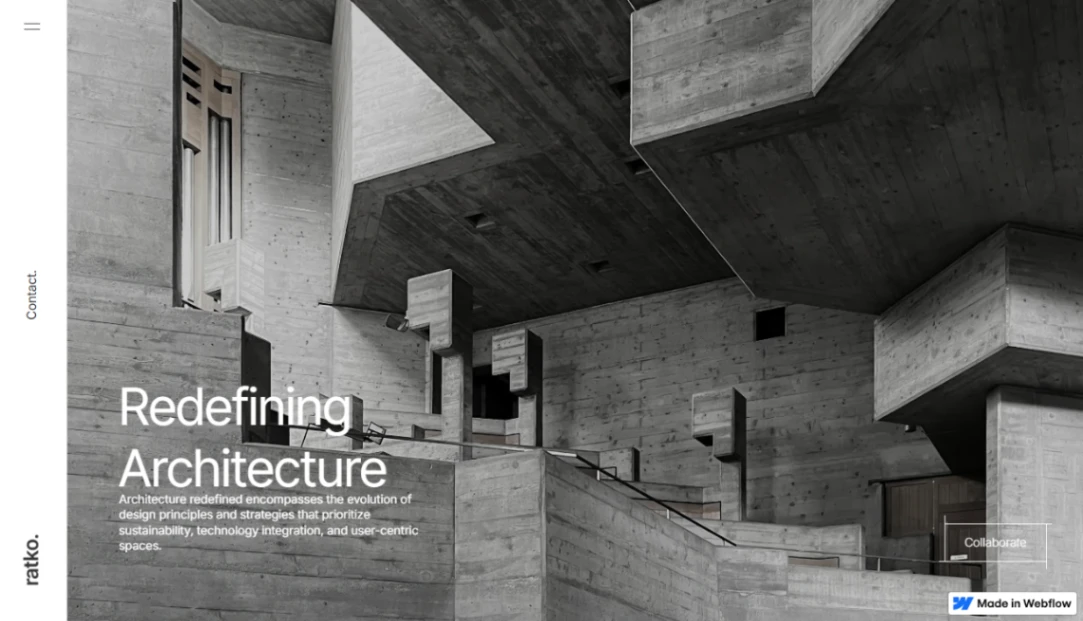
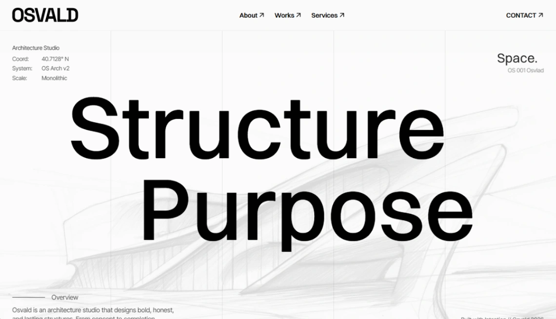
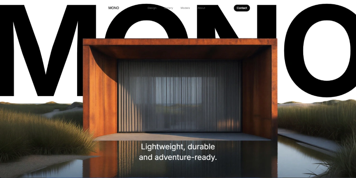
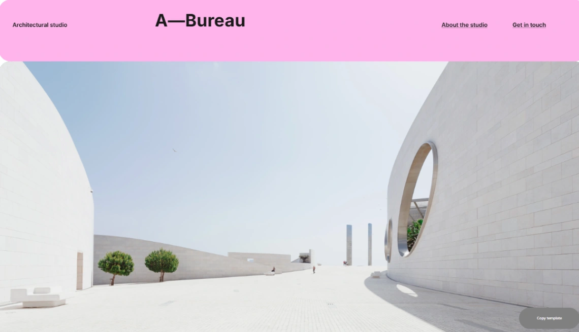
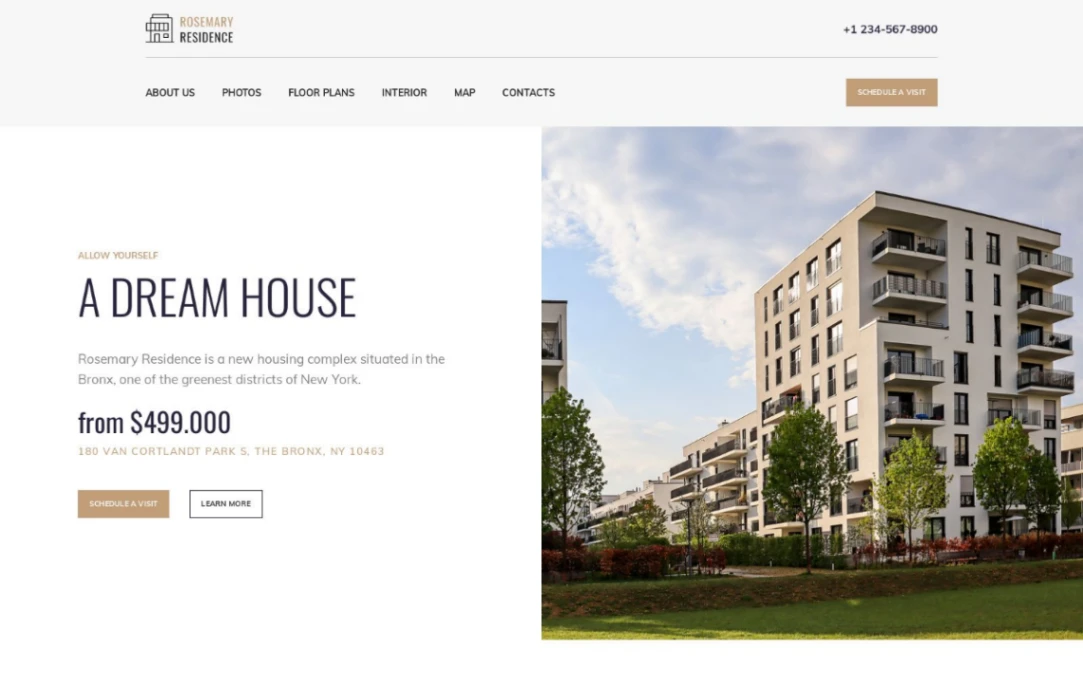
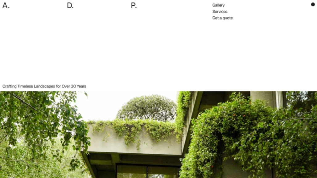
Architecture is experienced at walking pace, and its portfolios should be too. The strong templates in this collection understand pacing as a design material: long scrolls, full-width images given room, white space that functions like the pause before entering a building. What they refuse is the thumbnail-grid instinct — forty projects at postage-stamp scale reads as a directory, and directories don't win commissions.
Edit like a monograph: six projects, complete. Each project page should walk its visitor through the way you'd walk a client through — the brief and its constraints, the site, one or two process artifacts (a sketch, a model, a drawing that shows thinking), then the built work photographed properly. The CMS-backed builders in the pinned picks make that walkthrough a repeatable structure rather than a bespoke effort per project.
Drawings deserve first-class treatment, not decoration. Plans and sections communicate to the readers who matter most — clients who've learned to read them, and the professional audience deciding whether to publish, refer or join you. A portfolio of finished photography alone shows outcomes; the drawings show authorship.
Remember the site is read by two audiences with different questions: prospective clients asking "can they do my building," and peers, press and future staff asking "who are these people." Serve the first with project types and scales stated plainly, the second with credits, publications and the practice's actual position. And test the whole thing on a large screen and a phone — the profession reviews on 27 inches; the client's first visit happens on five.
FAQ