


Buyer's guide
How to choose a creative template
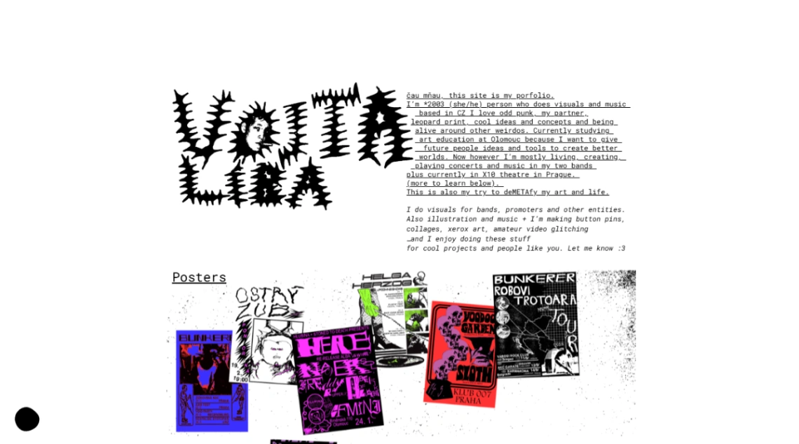
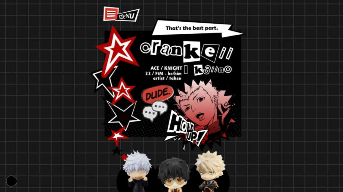
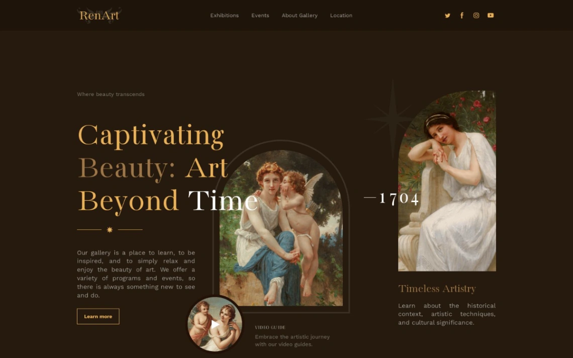
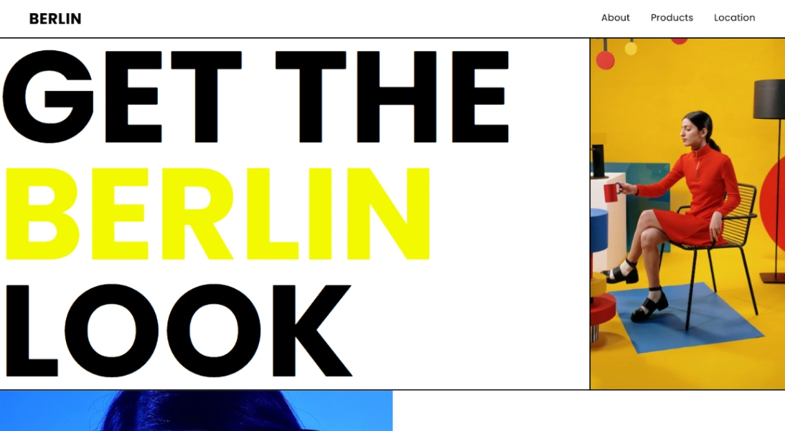
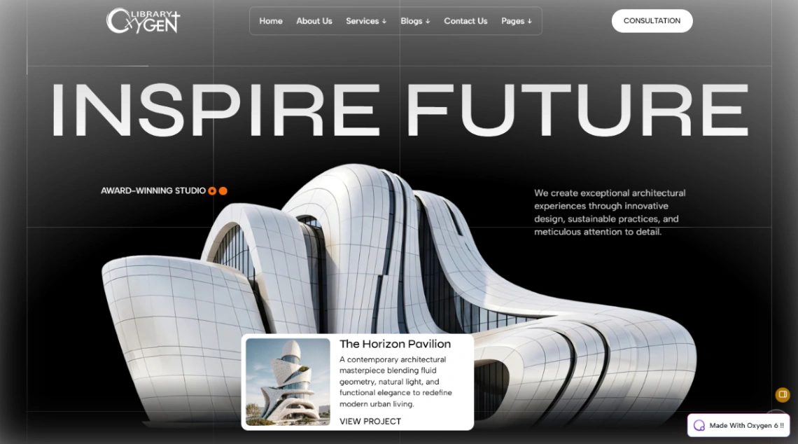
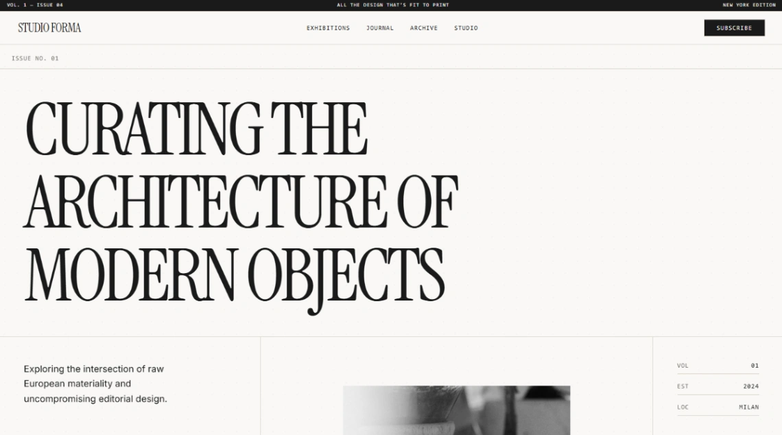
The rules that keep business websites safe are the ones this collection exists to break — asymmetric grids, oversized type, cursor tricks, layouts that scroll sideways. Breaking them well requires knowing what the rule protected. So before falling for an experiment, ask the only question that matters here: when someone leaves this site, do they remember my work, or the template's choreography?
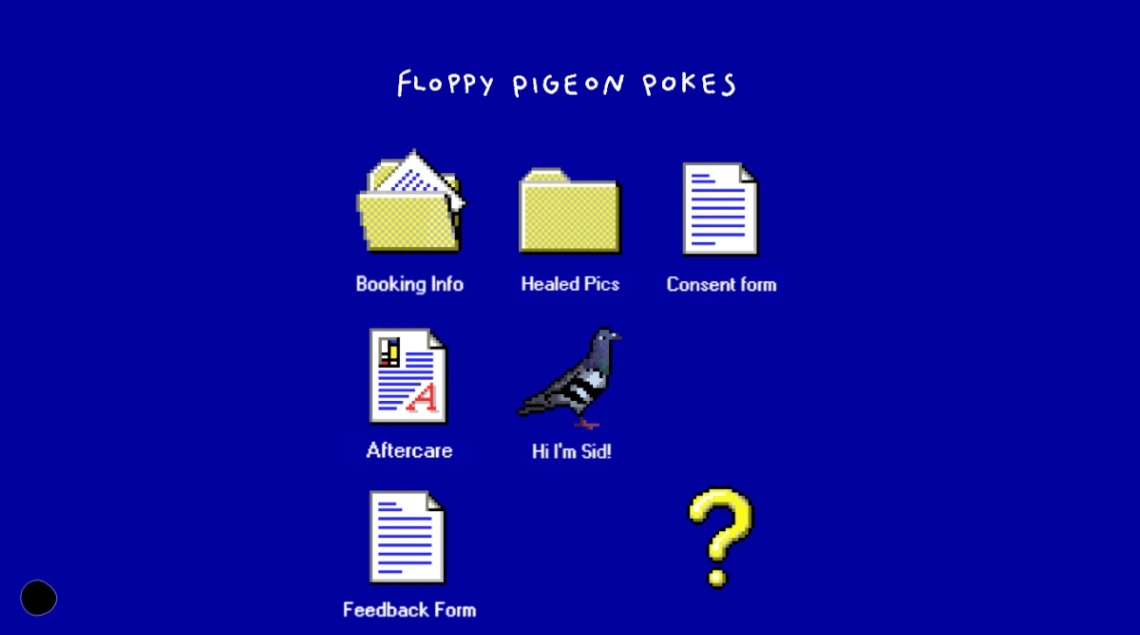
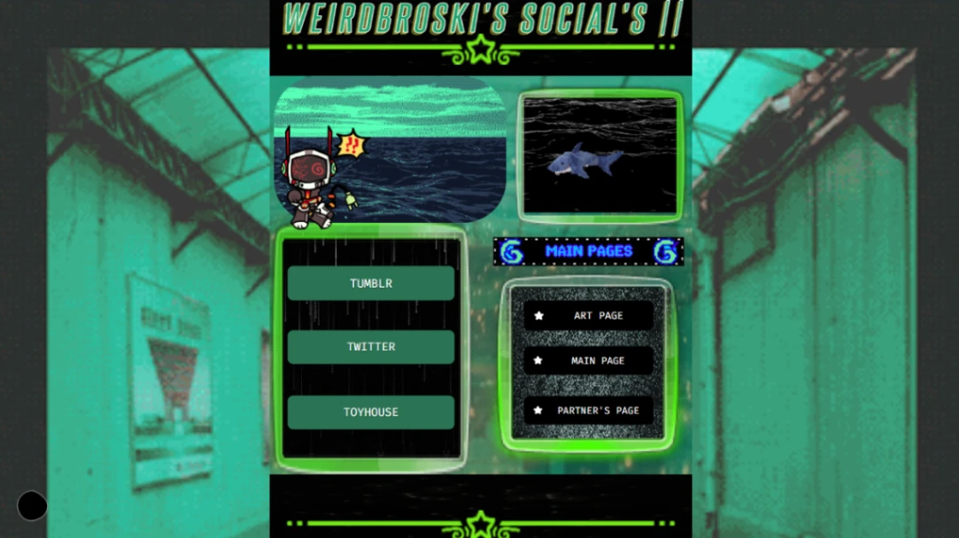
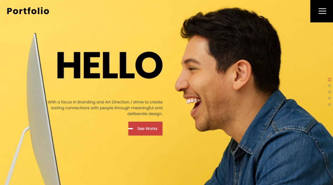
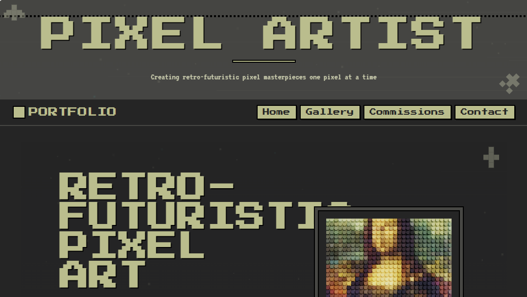
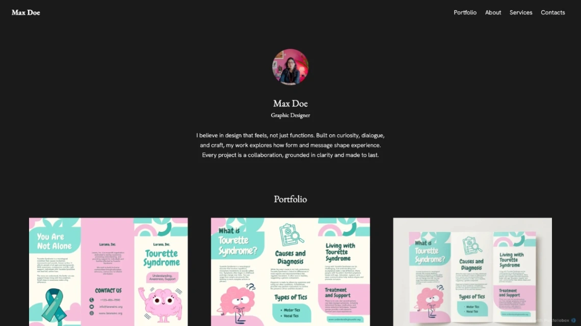
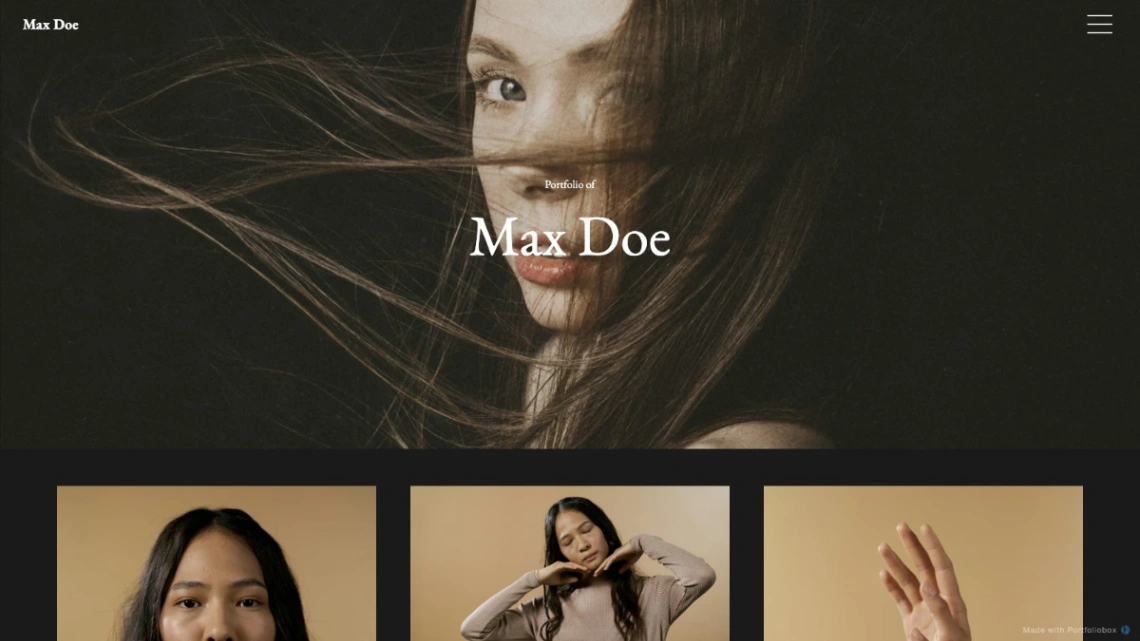
Judge experiments by your audience's patience. Art directors and fellow creatives will forgive — even expect — a site that makes them work a little; a first-time client with a budget and a deadline will not. The wilder templates in this collection are portfolio pieces in themselves, which is precisely the problem if your own portfolio needs the spotlight. Pick the experiment whose energy matches what you sell.
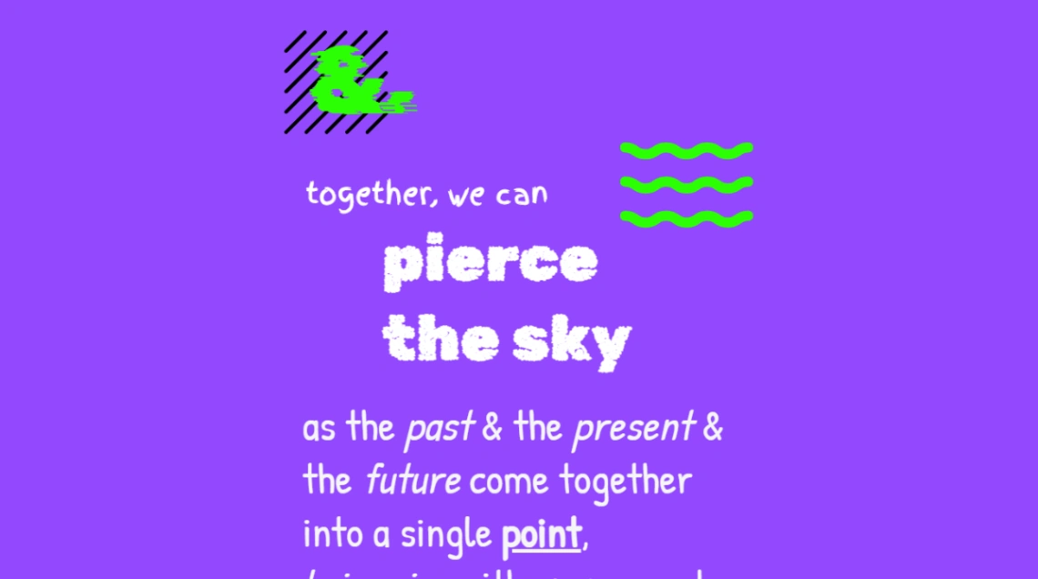
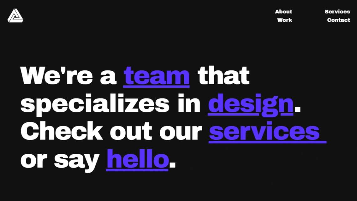
Motion and typography are the two budgets to spend deliberately. Animation that reveals work earns its load time; animation that performs for its own sake taxes every visit twice — once in seconds, once in attention. Display type that sets a mood on the landing page becomes a reading obstacle by the third paragraph. The strong templates here spend both budgets in one or two places and stay quiet everywhere else.
And plan for the experiment aging, because novelty has a half-life. The horizontal-scroll site that feels electric this year reads as that-year by next. Favor templates whose boldness you can dial down without rebuilding — swap the type, calm the motion, keep the bones. The design-led builders behind this collection are pinned at the top of the page.
FAQ