









Buyer's guide
How to choose a school template
A school website is civic infrastructure with an admissions funnel attached, and the two jobs serve different people on different missions. Prospective parents arrive evaluating — ethos, results, safety, "will my child be happy here" — while current families arrive navigating: term dates, today's notice, what to bring Thursday. Templates that separate these paths cleanly (admissions one way, everyday life the other) serve both; sites that blend them serve neither.
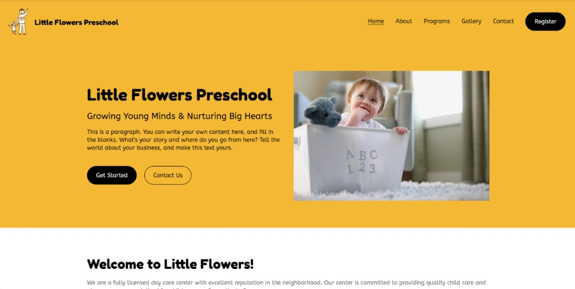
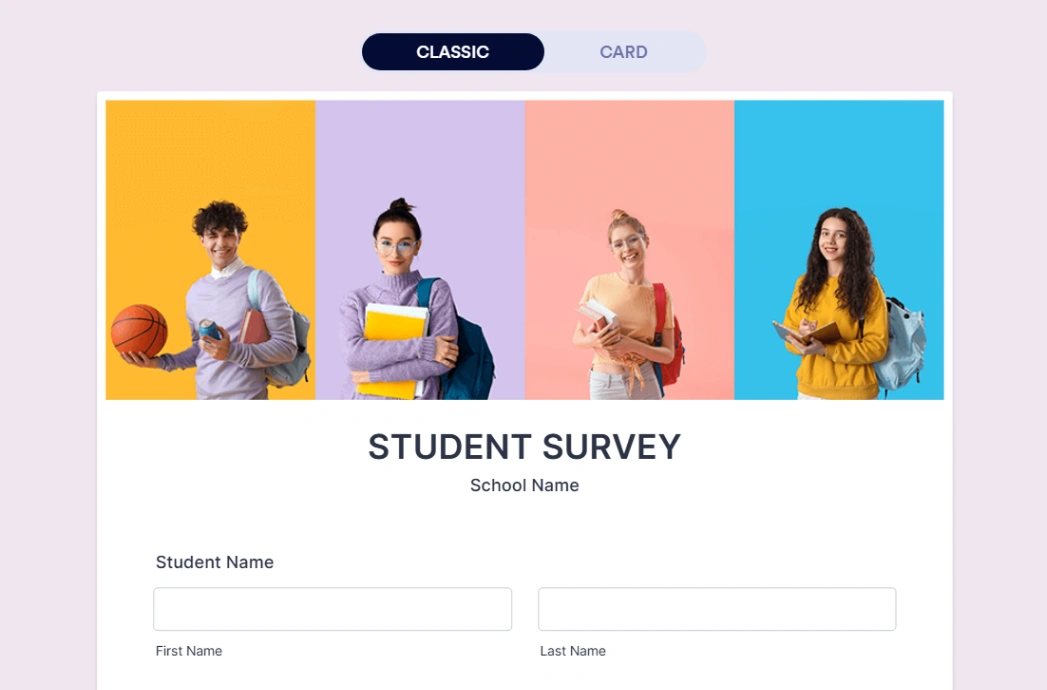
The admissions funnel deserves real machinery: an open-day booking that works, the application process explained step by step with dates, and the questions every evaluating parent has — fees where applicable, catchment, class sizes — answered before the visit. The form-capable builders in the pinned picks handle visit bookings and enquiries; what they can't supply is the honesty of real photographs of real school life, which outperform prospectus gloss with every parent who's read one.
For current families, the calendar is the trust surface. One wrong date — a mislisted inset day, last term's fixtures — and parents stop checking, which kills the site's everyday value permanently. Give calendar updates to a named owner, keep term dates one tap from the homepage, and let notices flow through a section the office can update in a minute.
Two disciplines frame everything: safeguarding-conscious imagery (consent handled, children identifiable only within policy) and accessibility, because the site serves every family the school does — including the ones on old phones, with little English, checking one thing in a hurry. Plain structure isn't a design compromise here; it's the brief.
FAQ