What Is Responsive Design? A Plain Guide 2026

Responsive design is the practice of building one website that reshapes itself to fit any screen, from a 320 CSS pixel phone to a widescreen desktop. It replaced fixed-width layouts and separate m.domain.com mobile sites with a single codebase served from a single URL.
Table of Contents:
- Key Takeaways
- Introduction
- What Is the Responsive Design Idea That Replaced Fixed-Width Layouts?
- How Does Responsive Design Actually Work Inside a Browser?
- Why Did The Boston Globe Redesign Convince the Industry?
- Is a Responsive Site Better Than a Separate Mobile Site or an App?
- Why Do Responsive Pages Keep Getting Heavier Every Year?
- What Is the Responsive Design Requirement Regulators Now Enforce?
- Frequently Asked Questions
Key Takeaways
- Responsive design was named in 2010, but its founding argument was published a decade earlier by a developer nobody credits on launch-day slides.
- The Boston Globe proved the business case in three months, then became the exhibit critics used to attack responsive design's biggest weakness.
- Mobile pages are now roughly eleven times heavier than in 2010, which quietly turned a layout technique into a performance and compliance problem.
Introduction
Median mobile homepages reached 2.56 MB in 2025 according to the HTTP Archive Web Almanac page weight report, meaning the average phone visitor to an independent photographer's portfolio downloads more data than a 1990s PC game shipped on. So what is the responsive design approach actually solving, and does it hold up at that weight? For photographers and small studio owners who maintain their own booking pages, the answer has money attached to it. A gallery that breaks at 375 pixels loses the enquiry before anyone reads the pricing page.
This guide walks through where responsive design came from, how the CSS behaves under the hood, what the page-weight data shows, and which accessibility rules now carry hard legal deadlines.
What Is the Responsive Design Idea That Replaced Fixed-Width Layouts?
The idea is older than the label. On April 7, 2000, developer John Allsopp published "A Dao of Web Design" on A List Apart, arguing that forcing print-style pixel control onto web pages was a fundamental mistake rather than a craft standard. Ethan Marcotte gave that philosophy a name and a working method ten years later.
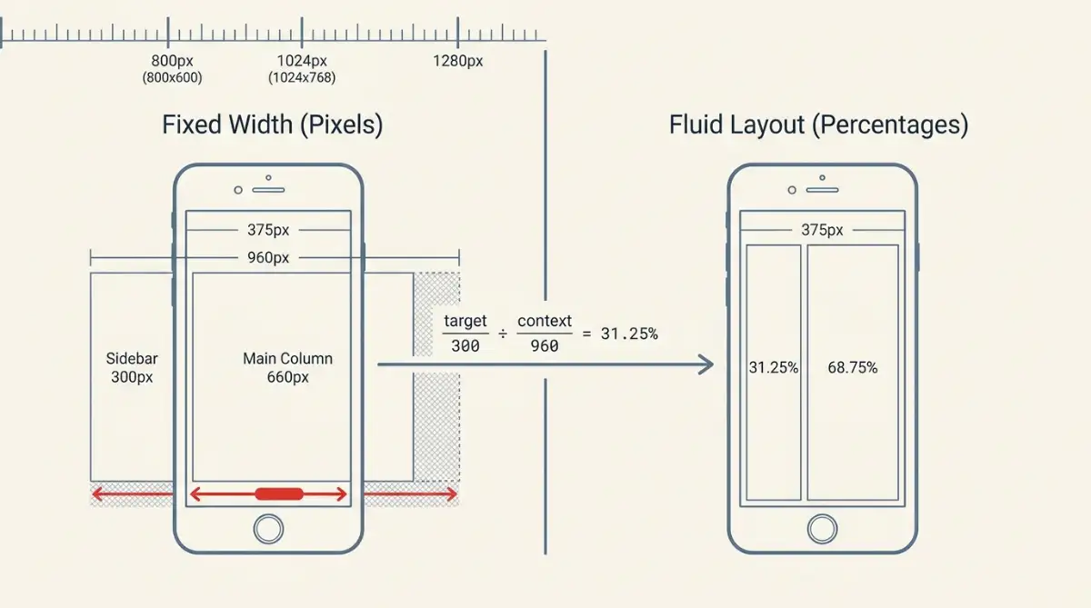
Through the late 1990s and mid-2000s, sites were built to fixed pixel widths chasing whatever monitor was selling: 800x600, then 1024x768, then 1280. According to Geoff Ford, that progression defined layout decisions for roughly fifteen years. The vocabulary came straight from desktop publishing too, with mastheads, leading and "the fold" imported wholesale, a habit that also produced the table layout era that broke the early web.
"It is the nature of the web to be flexible, and it should be our role as designers and developers to embrace this flexibility." John Allsopp, A List Apart, April 7, 2000
Marcotte published "Responsive Web Design" on A List Apart on May 25, 2010, borrowing the term from responsive architecture, a discipline where physical structures adjust to human presence. The lineage matters more than the trivia:
- April 7, 2000: Allsopp publishes "A Dao of Web Design"
- May 25, 2010: Marcotte names the practice and unifies three existing techniques
- June 19, 2012: W3C elevates CSS3 Media Queries to official Recommendation
- April 21, 2015: Google's mobile-friendly update, nicknamed "Mobilegeddon," penalises non-responsive sites in mobile results
- 2018: Jen Simmons coins "Intrinsic Web Design" for the next phase
Responsive design invented no new technology. It renamed three old ones and insisted they be used together.
How Does Responsive Design Actually Work Inside a Browser?
Three mechanisms do the work. A fluid grid sizes columns in percentages instead of pixels, flexible media scales inside whatever container holds it, and CSS media queries apply conditional style blocks based on what the browser reports about the screen. Everything modern builds on that base.
Marcotte's original conversion was arithmetic anyone can run: target ÷ context = result. A 300-pixel column inside a 960-pixel parent becomes 300 ÷ 960, or 31.25%, according to Geoff Ford's breakdown of the method. Nobody calculates those by hand anymore, because CSS absorbed the job:
- CSS Grid:
repeat(auto-fit, minmax(280px, 1fr))builds a responsive gallery grid with no media queries at all - Flexbox: handles single-axis alignment through
flex-grow,flex-shrinkandflex-wrap - Dynamic math:
font-size: clamp(1rem, 4vw, 3rem)scales type with the viewport while guaranteeing it never drops below 1rem - Responsive images:
srcsetandsizeshand the browser a menu of files, and<picture>allows art direction across AVIF, WebP and JPEG
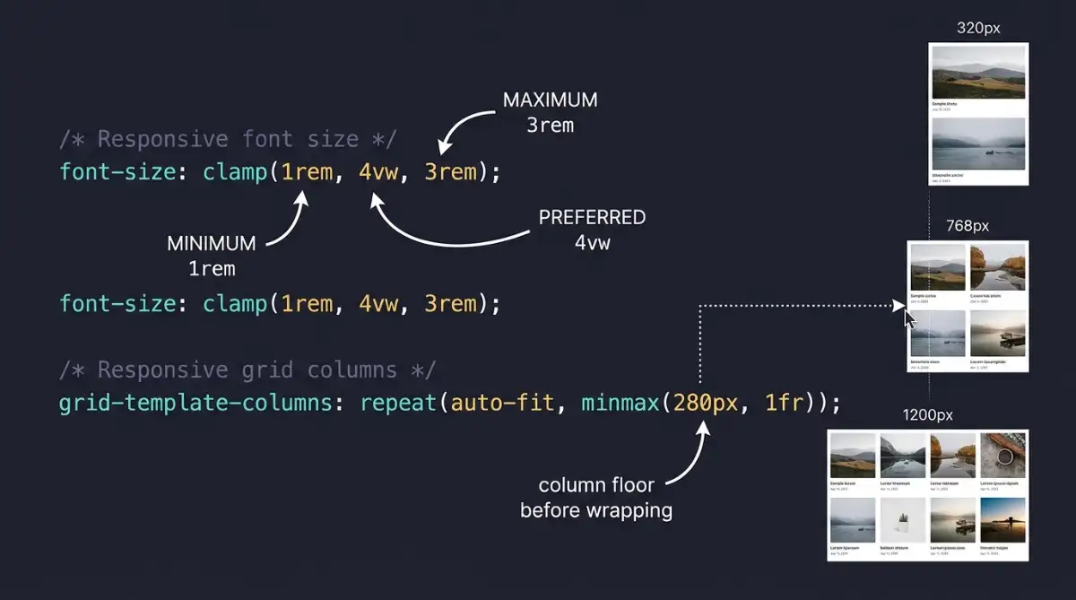
The part I still think is underrated is clamp(), because it removes the need to guess at breakpoints for typography entirely. Media Queries Level 4 went further, adding features like pointer (none, coarse, fine), hover and script, so a booking form can adapt to a thumb rather than to a screen width.
Media queries ask what the device can do. Fluid layout decides what happens between those answers, which is where most of a visitor's session is actually spent.
Why Did The Boston Globe Redesign Convince the Industry?
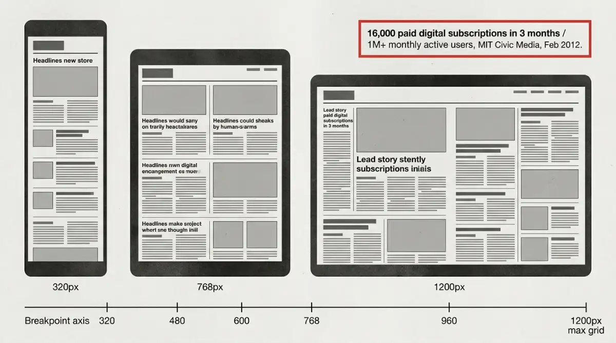
Theory needed a commercial proof point. In September 2011, agency Upstatement and engineering consultancy Filament Group launched a fully responsive bostonglobe.com in collaboration with Marcotte, built on a 1200-pixel maximum grid with six distinct breakpoints. It replaced the paper's separate mobile site entirely.
The numbers landed fast. According to MIT Center for Civic Media's reporting on the launch, the redesign produced 16,000 paid digital subscriptions within three months and sustained over 1 million monthly active users. For a major publisher to serve desktops, tablets and phones from one codebase was, at the time, an unproven bet.
The Boston Globe did not just prove responsive design worked. It proved a single codebase could carry a paywall.
Then came the criticism, and it was fair. According to mobiForge, early responsive builds shipped the full desktop DOM and heavy images to phones and simply hid the excess with display: none. The Globe site itself struggled on constrained hardware like the Motorola RAZR and Nokia 6100, because a single codebase meant a single payload over high-latency 3G.
That gap produced an alternative. In September 2011, Luke Wroblewski proposed RESS, short for Responsive Design plus Server-Side Components, using server-side detection to strip heavy components before the HTML ever reached a phone.
Is a Responsive Site Better Than a Separate Mobile Site or an App?
For most portfolio and booking sites, responsive wins on maintenance and search visibility. Separate m.site.com subdomains split backlink authority across duplicate URLs and duplicate the content workflow. Native apps deliver hardware access that browsers cannot match, at the cost of two engineering teams and app store distribution.
| Approach | Best fit | Layout behaviour | Maintenance cost |
|---|---|---|---|
| Responsive Web Design | Content, portfolios, e-commerce, one canonical URL | Continuous fluid adaptation at every width | Low, single codebase |
| Adaptive / RESS | High-traffic apps needing per-device payloads | Discrete step changes per device bucket | Moderate to high, server device database |
| Native mobile app | Offline tools, GPU work, deep hardware use | Fixed to OS screen patterns | High, separate iOS and Android teams |
| Mobile subdomain (m.site.com) | Legacy retrofits only | Rigid, targets specific phone widths | High, duplicate content and codebases |
Sources: WhatIsDesign (2024), Luke Wroblewski (2011), mobiForge (2012), InternetDevels (2015)
The honest answer depends on what your product physically needs. If the core experience involves continuous GPS tracking, low-latency Bluetooth pairing or GPU shaders, a browser is the wrong container and you should compare native app versus web app tradeoffs properly before committing. If the answer is "clients need to see 40 photographs and book a shoot," responsive is not a compromise, it is the correct architecture.
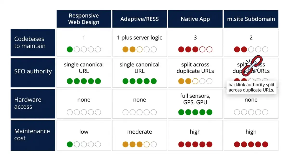
Worth noting for anyone weighing a middle path: progressive web apps sit between the responsive site and the native build, keeping one URL while borrowing app-like behaviour.
Why Do Responsive Pages Keep Getting Heavier Every Year?
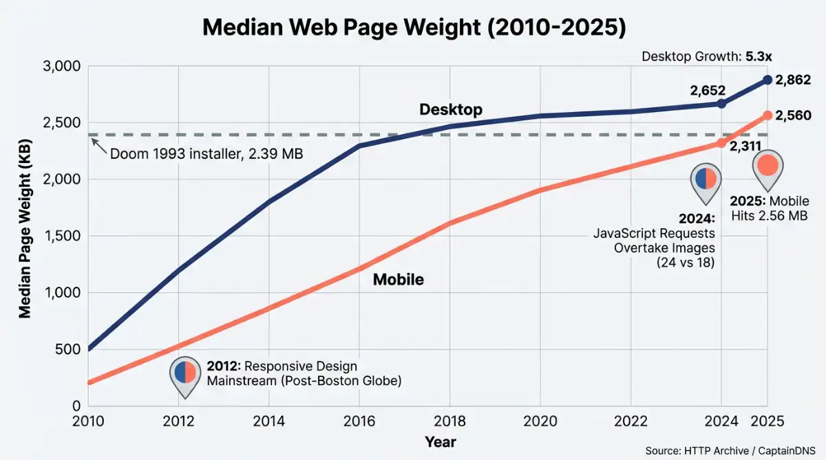
Because responsive layout says nothing about payload. According to HTTP Archive data compiled by CaptainDNS, median desktop page weight grew 5.3-fold from roughly 500 KB in 2010 to 2,652 KB in 2024, while mobile expanded 11.5-fold from around 200 KB to 2,311 KB across the same window.
| Resource | Median mobile weight | Share of payload |
|---|---|---|
| Images | 900 to 911 KB | 36% to 40% |
| JavaScript | 558 KB | ~23% |
| Fonts | 111 KB | ~5% |
| CSS | 73 KB | ~3% |
| HTML | 18 KB | ~1% |
Source: HTTP Archive (October 2024), CaptainDNS (2025)
I have looked at plenty of photographer portfolios where one uncompressed hero image outweighed every other asset on the page combined, and the layout was flawless the whole time. A quieter milestone passed in 2024, when JavaScript file requests overtook image requests in frequency, averaging 24 JavaScript calls against 18 image calls per page load. Images still dominate the bytes, though, and they are what Largest Contentful Paint measures on 73% of mobile pages according to Sammapix.
Format adoption is moving slower than the bloat. W3Techs data reported by Sammapix puts WebP at 19.7% of all websites as of April 2026 and AVIF at just 1.3%, despite AVIF delivering roughly 50% savings against JPEG and WebP delivering 25% to 34%. Only 48% of mobile pages currently pass all three Core Web Vitals thresholds.
The commercial stake is measurable: Google and Deloitte research found a 0.1 second improvement in mobile speed lifts e-commerce conversion by 8.4%. If you are running a gallery-heavy portfolio, image format is not a technical footnote, it is your conversion rate. It is also why template choice affects SEO more than most people assume.
What Is the Responsive Design Requirement Regulators Now Enforce?
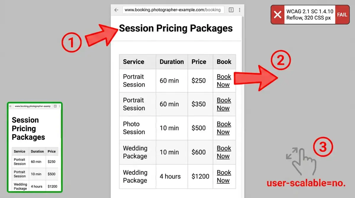
Responsiveness stopped being a preference in June 2018, when WCAG 2.1 Success Criterion 1.4.10, Reflow, codified it. The criterion requires content to work at a 320 CSS pixel width, equivalent to a 1280px desktop window at 400% zoom, without two-dimensional scrolling or lost functionality.
Deadlines are now attached. According to ADA Compliance Pros, state and local government entities serving populations of 50,000 or more must meet WCAG 2.1 Level AA by April 26, 2027, with smaller public entities and federally assisted healthcare providers following on May 11, 2027. Colorado public entities have been legally bound under 8 CCR 1501-11 since July 1, 2024.
Performance rules tightened in parallel. On March 12, 2024, Google replaced First Input Delay with Interaction to Next Paint, measuring responsiveness across every tap and click in a page's lifecycle, with 200 milliseconds as the threshold to stay clear of ranking penalties.
Four implementation patterns fail reflow audits repeatedly:
- Fixed pixel heights on text containers, which clip wrapped text when someone enlarges their system font
- Unbounded viewport units like
font-size: 3vw, which ignore browser zoom entirely user-scalable=noin the viewport meta tag, which disables pinch-to-zoom- Device-specific breakpoints such as
@media (width: 375px), which break the moment a new handset ships
Where this is heading is component-level control. CSS Container Queries let an element respond to its parent's width instead of the window, so the same gallery card renders compact in a sidebar and multi-column in a main content area, and the W3C Viewport Segments API extends the model to foldables and dual-screen hardware.
"Content should transform to fit into arbitrary constraints, instead of letting the content decide when it should shift into a more appropriate layout." Jen Simmons, The Big Web Show, May 2, 2018
Start exploring launch-ready no-code templates here!
Starting from a tested foundation saves a lot of breakpoint debugging, and there are free portfolio website templates built responsive out of the box.
Frequently Asked Questions
Is responsive design the same as mobile-first design?
No. Responsive design describes the outcome, a layout that adapts to any screen. Mobile-first is a methodology Luke Wroblewski advocated, where you establish core usability on constrained screens first, then progressively enhance for larger displays. Most responsive sites today are built mobile-first, but the terms are not interchangeable.
Does responsive design still affect Google rankings?
Yes. Google's mobile-friendly update on April 21, 2015 made mobile layout a ranking signal, and Core Web Vitals extended that to performance. Since March 2024, Interaction to Next Paint measures responsiveness across a page's full lifecycle, with 200 milliseconds as the working threshold.
What screen width should I test my site at first?
Start at 320 CSS pixels. That is the width WCAG 2.1 Success Criterion 1.4.10 specifies, matching a 1280px desktop window at 400% zoom. If your content reflows cleanly there without horizontal scrolling or clipped text, wider viewports rarely cause problems.
Do drag-and-drop website builders handle responsive design automatically?
Most modern builders generate responsive output by default, but defaults are not audits. Check that images use modern formats, that no container carries a fixed pixel height, and that pinch-to-zoom is not disabled in the viewport meta tag before you publish.
Is a responsive website enough, or do I also need a mobile app?
For portfolios, booking pages and e-commerce, a responsive site is usually sufficient and keeps everything on one canonical URL. Apps earn their cost when a product needs offline storage, background GPS, device sensors or heavy graphics processing that a browser cannot reach.
Start building without code
Browse thousands of no-code templates for Webflow, Framer, Bubble, Lovable, Replit and more.
Explore Templates