UI vs UX: Why Pretty Screens Still Fail

UI design covers the visual and interactive surface of a product, including typography, color, layout, and control states. UX design covers the full encounter around that surface, from first expectation through the task and the aftertaste. ISO 9241-210:2019 defines user experience as a person's perceptions and responses resulting from the use and anticipated use of a product, system, or service.
Table of Contents:
- Key Takeaways
- Introduction
- Who Named User Experience, and Why Was Interface Too Small?
- How Do Garrett's Five Planes Split Strategy From Surface?
- What Does UI vs UX Change in Pay, Tools, and Job Titles?
- Why Do UI vs UX Mix-Ups Turn Into Nine-Figure Losses?
- Why Did Snapchat and Marks & Spencer Prove Redesigns Can Backfire?
- Why Are Overlay Widgets and Dark Patterns Now a Legal Cost?
- Decision Framework
- FAQ
Key Takeaways
- Citibank's Flexcube disaster was a checkbox story, which is why a brand refresh would not have saved that wire or the six-eye review that still said yes.
- Snapchat's 2018 lesson is that navigation memory is a balance-sheet asset, and the public stock market can reprice it before the next quarterly call to advertisers.
- Overlay widgets keep appearing in roughly a quarter of recent accessibility lawsuits because they decorate a semantic HTML problem that the underlying page templates never actually solved.
Introduction
I have sat with freelance site builders and in-house marketers at local shops who spent three days swapping fonts, then lost the sale on a four-field checkout. UI vs UX is the name of that mismatch, and it shows up the moment a pretty template meets a tired customer on a phone.
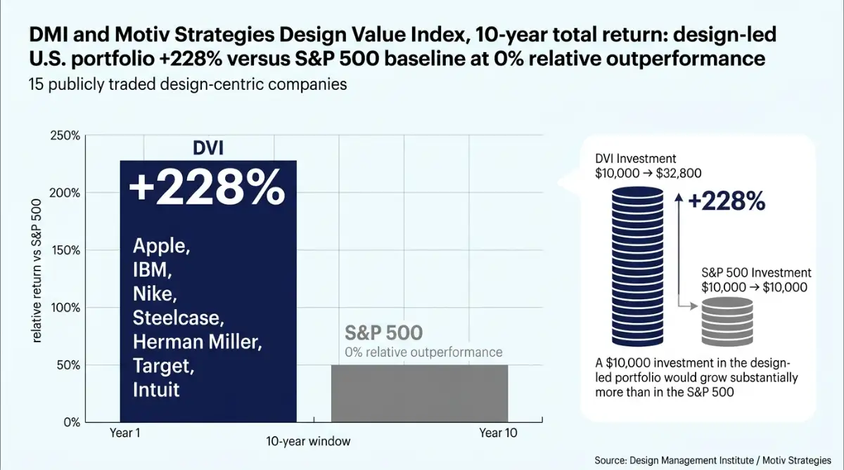
According to the Design Management Institute and Motiv Strategies, a 15-company design-led portfolio beat the S&P 500 by 228% over ten years. Pretty is not the whole bet. The Flexcube wire and Snapchat's 2018 navigation both prove the other half can erase a year of visual work in a week.
I will walk the 1993 Apple job title, Jesse James Garrett's five planes, the salary gap on Glassdoor, and the exact screens that burned Citibank, Epic Games, and Marks & Spencer.
Who Named User Experience, and Why Was Interface Too Small?
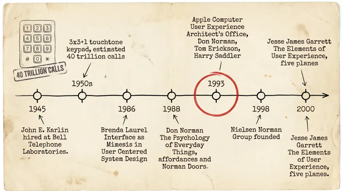
User experience as a named practice is older than the web. Brenda Laurel put the ideal user experience into HCI print in 1986. Don Norman, Tom Erickson, and Harry Saddler then opened Apple Computer's User Experience Architect's Office in 1993, because screen chrome and hardware drawings were too small a frame.
John E. Karlin joined Bell Labs in 1945. His 1950s group tested spacing and dialing accuracy until the 3x3+1 touchtone keypad stuck. That keypad has handled an estimated 40 trillion calls.
Laurel's chapter, Interface as Mimesis, sat in User Centered System Design.
Ask, not what the users are willing to endure, but what the ideal user experience might be.
Norman published The Psychology of Everyday Things in 1988. He and Jakob Nielsen founded Nielsen Norman Group in 1998, and Jesse James Garrett mapped five planes in 2000.
- 1945-1950s: Karlin, Bell Labs, touchtone keypad
- 1986: Laurel names the ideal user experience
- 1993: Apple User Experience Architect's Office
- 1998-2000: NN/g heuristics, then Garrett's planes
He widened the unit of work from the screen to the box, the manual, and first power-on, as he later spelled out.
How Do Garrett's Five Planes Split Strategy From Surface?
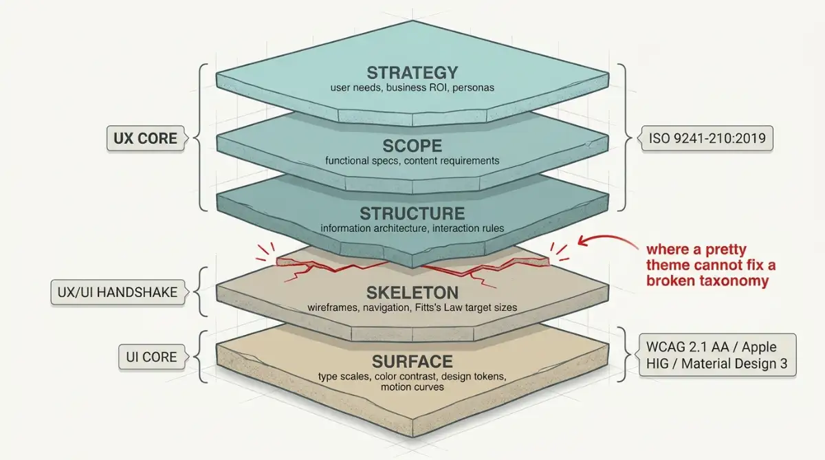
Jesse James Garrett's 2000 model stacks five planes from business intent to pixels. Strategy, Scope, and Structure are mostly experience work, Skeleton is the handshake, and Surface is type scales, tokens, and motion. That stack is why a new theme cannot fix a broken taxonomy.
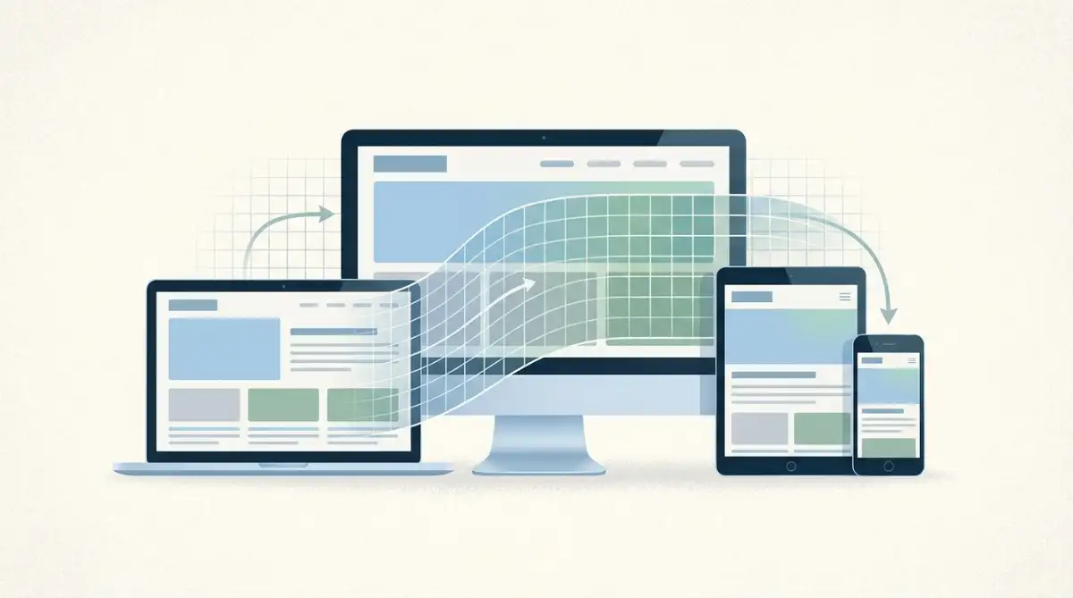
A person arrives with a mental model borrowed from the last tool they trusted. The product runs on an engineering conceptual model. Experience work tries to line those two up with affordances (what the thing can do) and signifiers (the cues that say where to act). Interface work paints those cues, including responsive layout rules that keep tap targets honest on a phone.
Steve Jobs put the same split in a November 30, 2003 New York Times Magazine interview. He was tired of teams treating design as a veneer handed a finished box.
It's not just what it looks like and feels like. Design is how it works.
If the surface is gorgeous and the structure is wrong, you have decorated a maze.
| Dimension | UX design | UI design |
|---|---|---|
| Primary domain | Task flow, cognitive load, emotion | Visual hierarchy, type, color, spatial layout |
| Methods | Research, journeys, usability tests, heuristics, card sorting | Type scales, color, grids, component states, design tokens |
| Artifacts | Personas, flows, wireframes, service blueprints | High-fidelity mockups, UI kits, motion specs |
| Success metrics | Task completion, time on task, error rate, SUS | WCAG contrast, brand consistency, responsiveness, render latency |
| Governing standards | ISO 9241-210:2019 | WCAG 2.1/2.2 AA, Apple HIG, Material Design 3 |
What Does UI vs UX Change in Pay, Tools, and Job Titles?
Pay and tooling make the split concrete. According to Glassdoor figures for 2024, UX designers sit near $109,955 and UI designers near $93,440. Interaction design leads that sheet at $114,381. The tooling story is harsher: InVision died on December 31, 2024, and Figma took the floor.
According to the U.S. Bureau of Labor Statistics, the May 2024 median wage for web developers and digital designers was $98,790. According to Forrester Research, a dollar put into experience work returns about $100, a 9,900% ROI via conversion and lower support load.
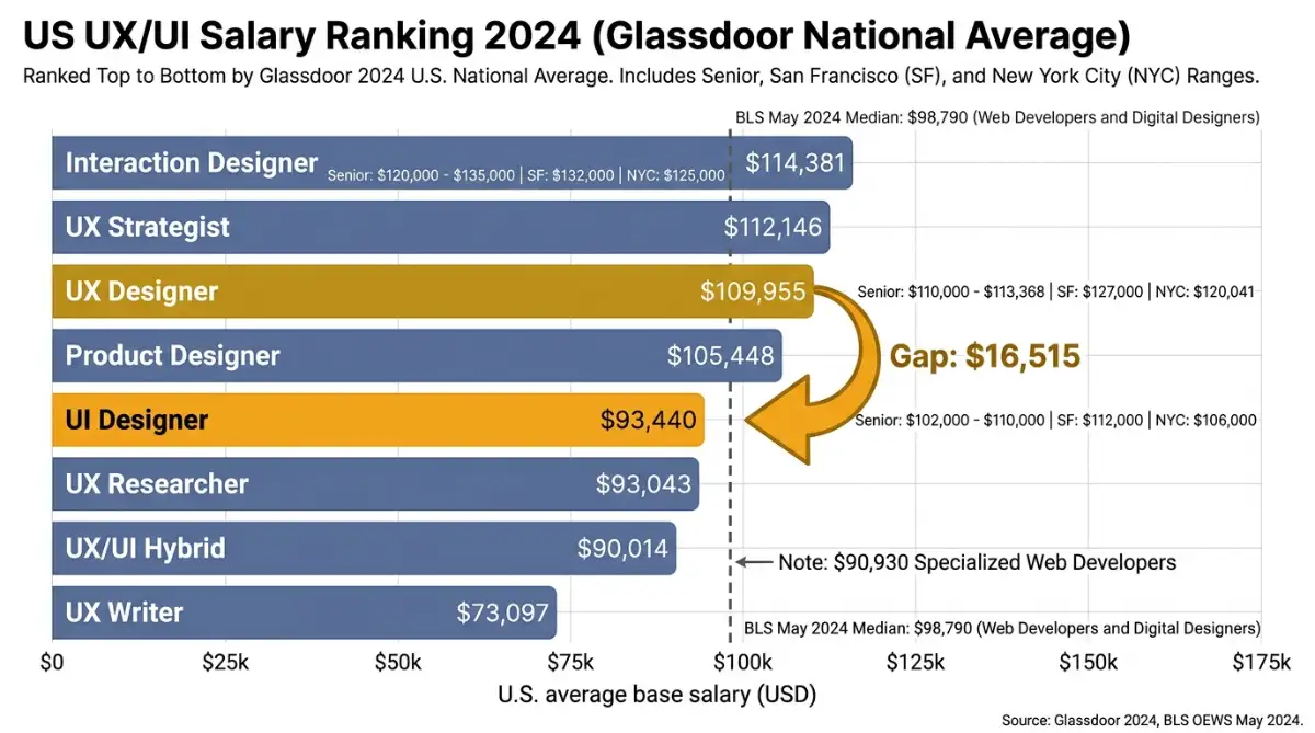
Enterprise teams now hire Product Designers who own research, wireframes, tokens, and handoff. A hybrid UI/UX posting averaged about $90,014, which should kill the idea that combining words raises the bid.
| Role (U.S., Glassdoor 2024) | Average salary | Senior band |
|---|---|---|
| Interaction designer | $114,381 | $120,000 to $135,000 |
| UX strategist | $112,146 | $125,000 to $142,000 |
| UX designer | $109,955 | $110,000 to $113,368 |
| Product designer | $105,448 | $115,000 to $130,000 |
| UI designer | $93,440 | $102,000 to $110,000 |
| UX researcher | $93,043 | $105,000 to $115,000 |
| UX/UI hybrid | $90,014 | $98,000 to $106,000 |
InVision peaked near a $2 billion valuation, sold Freehand to Miro, then deleted its data on December 31, 2024. Adobe XD went to maintenance after Adobe's $20 billion Figma bid died in December 2023. Figma's ARR moved from $600 million in 2024 to $749 million, with reports of $1 billion ARR and more than 1,031 accounts above $100,000.

Why Do UI vs UX Mix-Ups Turn Into Nine-Figure Losses?
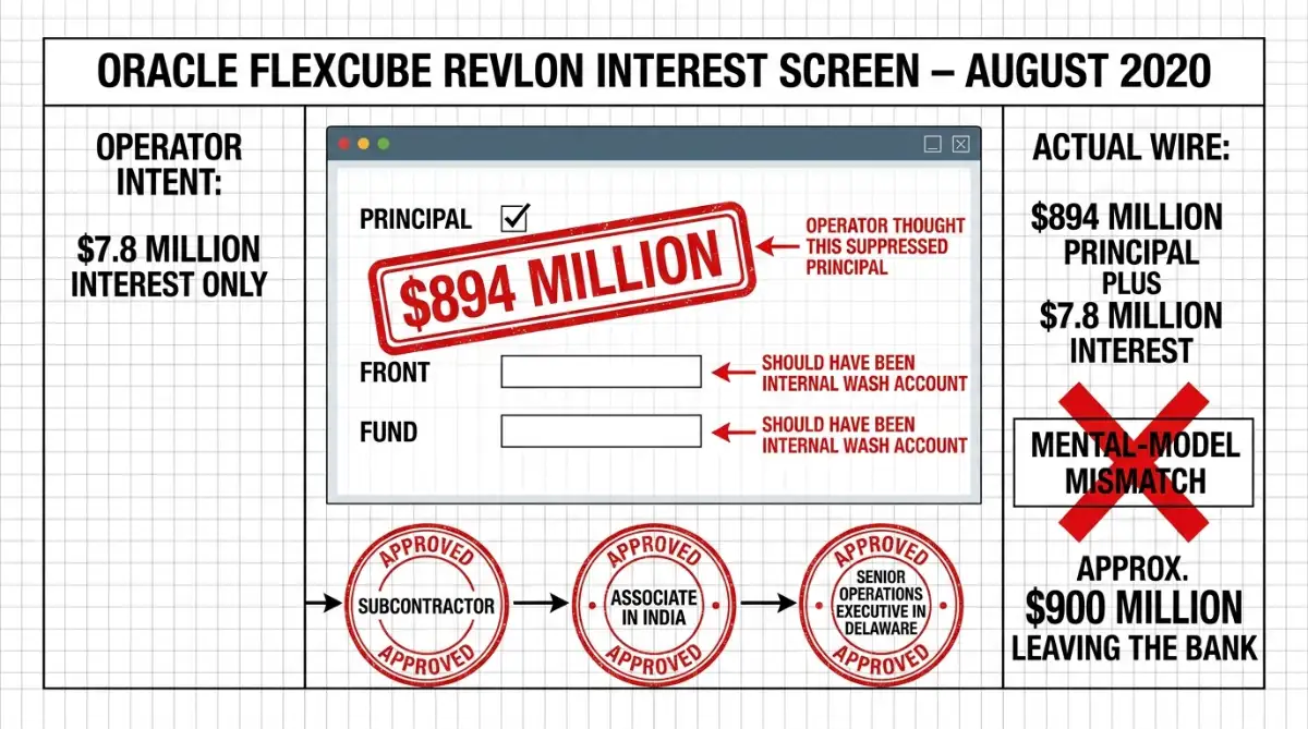
Mix-ups are not academic when the control is a wire or a purchase. In August 2020, Citibank meant to send $7.8 million of Revlon interest through Oracle's Flexcube and released $894 million of principal with it. In March 2023, the FTC extracted $245 million in Fortnite refunds from Epic Games for purchase traps.
Flexcube's checkboxes did not match operator instinct. Checking PRINCIPAL did not hold the $894 million back unless FRONT and FUND also pointed at an internal wash account. Citibank's six-eye review still passed: a subcontractor, an associate in India, and a senior operations executive in Delaware all thought the principal would stay inside the bank.
Three people can pass a six-eye review and still ship a disaster if the control lies about what a checkbox does.
Fortnite's traps were smaller per tap and larger in aggregate:
- A preview control billed immediately, with no confirmation dialog.
- Refund paths sat in obscure sub-menus.
- Accounts that disputed a charge were often locked.
The FTC treated that architecture as deception, not a growth hack. Local shops will not wire $894 million by accident. They will bury a cancel link the same way.
Why Did Snapchat and Marks & Spencer Prove Redesigns Can Backfire?
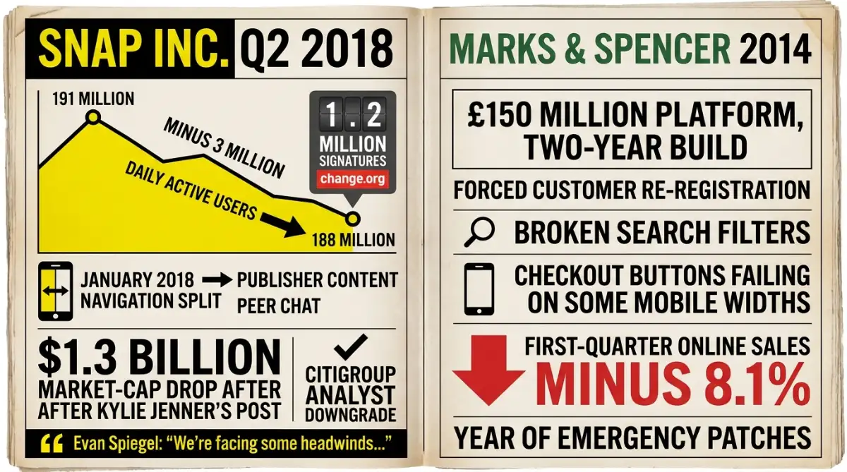
A redesign can look modern and still punish people who already knew the old map. Snap Inc. split publisher content from peer chat in January 2018, then watched daily users fall from 191 million to 188 million in Q2. Marks & Spencer's £150 million 2014 relaunch cut online sales 8.1% in the first quarter.
A Change.org petition drew 1.2 million signatures. Kylie Jenner posted against the app, and an estimated $1.3 billion left the market cap in a day.
Our redesign created some headwinds in our revenue this quarter by disrupting user behavior and creating some apprehension among our advertising partners.
Marks & Spencer spent two years on a modern store, then forced re-registration, served broken filters, and shipped dead checkout buttons on some mobile widths. I still preview checkout on a mid-range Android before I trust a desktop mockup.
Freelance site builders and in-house marketers at local shops repeat both stories when they replace a working landing page in one blast.
- Snapchat, January 2018: 3 million daily users gone in a quarter
- Marks & Spencer, 2014: 8.1% online sales drop after a £150 million relaunch
- The pattern: novelty first, memory last
Why Are Overlay Widgets and Dark Patterns Now a Legal Cost?
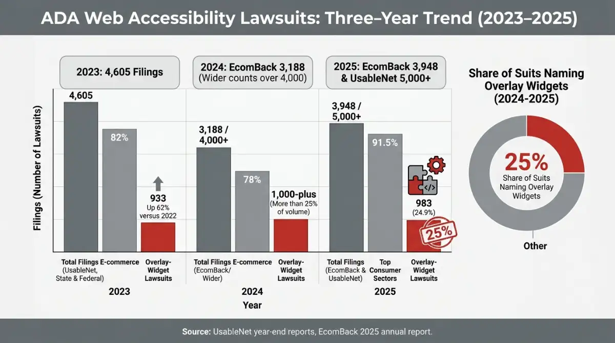
Interface ethics moved from blog posts to court dockets. UsableNet and EcomBack tracked thousands of ADA web filings a year from 2023 through 2025, mostly in e-commerce. About a quarter named overlay widgets. The FTC Epic order and the European Accessibility Act's June 2025 deadline now treat dark patterns and missing semantics as compliance failures.
A JavaScript overlay is a sticker on a locked door, and courts have started treating it like one.
| Year | ADA web filings (reported) | E-commerce share | Lawsuits naming overlay widgets |
|---|---|---|---|
| 2023 | 4,605 (state and federal, UsableNet) | 82% | 933 filings, up 62% vs 2022 |
| 2024 | 3,188 (EcomBack); over 4,000 in wider counts | 78% | 1,000-plus, more than 25% of volume |
| 2025 | 3,948 (EcomBack); 5,000-plus (UsableNet) | 91.5% in top consumer sectors | 983 filings, 24.9% of the set |
WCAG 2.1 and 2.2 AA still grade contrast, keyboard paths, and readable structure. An overlay does not rewrite the HTML a screen reader actually meets. According to UsableNet and EcomBack, about a quarter of 2024 and 2025 digital accessibility lawsuits named overlay widgets rather than a semantic HTML fix.
Dark patterns now sit in the same legal bucket: hidden renewals, hard cancel paths, and surprise charges. Typeform-style one-question flows can still be honest if every step is labeled and reversible.
Decision Framework
When a freelance site builder or in-house marketer at a local shop asks where the next dollar goes, I do not default to a new palette. I run five tests, in this order, and I am willing to starve visual craft if test one fails.
1. Price the error. If a wrong tap moves money, medical data, or a loan principal, fund experience work first: mental-model tests, not new gradients. Flexcube is the extreme, but a mislabeled "Pay now" on a shop site is the same class of bug.
2. Read the funnel, not the mockup. If a Squarespace page already looks current and people still drop, assume structural friction: forced accounts, surprise fees, or a maze. Restyling a broken flow is the lipstick-on-a-pig anti-pattern.
3. Check for feature parity. In consumer fintech, fitness tracking, and social apps, competitors often share the same features. There, type, motion, and a tight design system are how you get picked. I would not starve visual craft in that fight. A core banking screen is the opposite bet.
4. Watch builder velocity. If every new section means unique CSS, duplicate buttons, and a week of pixel arguing, buy UI infrastructure: tokens, a kit, and one source of states. That is how designer-led no-code stacks stop reinventing a form.
5. Audit legal shortcuts. Overlay widgets showed up in about a quarter of recent ADA filings. An unvalidated, all-at-once redesign is how Snapchat and Marks & Spencer taught the market. Stage the change, and keep a path back.
| Situation | Spend first | Do not do |
|---|---|---|
| High-error admin, payments, health | UX research, flows, six-eye-proof labels | Cosmetic restyle of the same logic |
| Drop-off despite a modern look | Journey and checkout tests | Another hero animation |
| Feature-parity consumer app | UI system, type, motion | Endless discovery with no craft |
| Slow builds, inconsistent components | Design tokens and a UI kit | One-off screens per page |
| Widget-only "accessibility" | Semantic HTML and WCAG AA | Overlay plugin as the plan |
It depends on the category, and that is the whole job. Pretty is a strategy in a parity market. Pretty is a costume in a high-error form.
Start exploring launch-ready no-code templates here!
FAQ
How is usability different from user experience? Usability under ISO 9241-11 scores a defined task on effectiveness, efficiency, and satisfaction in a stated context of use. That score can look fine while the person still dreads coming back, which is the wider experience problem teams miss when they only time a form.
What do UI designers earn compared with UX designers? Glassdoor figures for 2024 put U.S. UI designers at about $93,440, while UX designers average about $109,955. Interaction designers sit near $114,381, and the hybrid UI/UX title averaged about $90,014, so combining the words is not a raise.
What is a dark pattern? Dark patterns are interface choices built to push a click the person did not intend, such as a Fortnite preview that billed immediately. The FTC's March 2023 order required Epic Games to pay $245 million in consumer refunds for those purchase traps and buried refund paths.
Does a no-code website builder replace Figma? No, Figma became the default multiplayer canvas after InVision shut down and deleted its data on December 31, 2024, and Adobe XD went to maintenance. A no-code builder publishes pages, and it does not replace journey maps, usability tests, or a shared component library.
What is WCAG 2.1 AA? WCAG 2.1 AA is the W3C accessibility bar for contrast, operable controls, and understandable content. Overlay widgets do not rewrite semantic HTML, and UsableNet and EcomBack reporting shows about a quarter of ADA web lawsuits in 2024 and 2025 named sites that used those widgets.
Start building without code
Browse thousands of no-code templates for Webflow, Framer, Bubble, Lovable, Replit and more.
Explore Templates