Web Builders and the Table Layout Era: How It Broke the Web
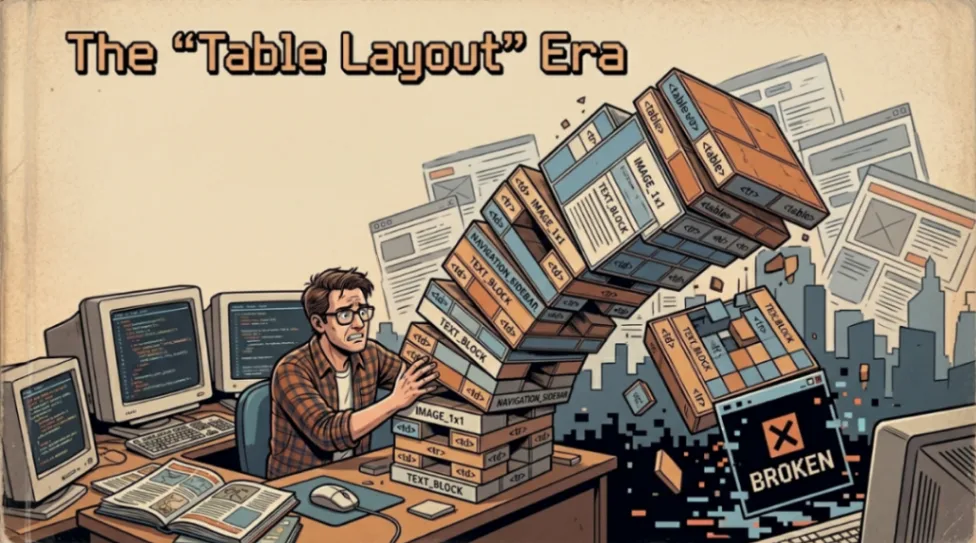
Between 1994 and 2002, early web builders repurposed the HTML table element, originally designed for data, as a layout tool. This created code bloat, destroyed accessibility, and fragmented browser standards. It took nearly a decade of advocacy from groups like WaSP to undo the damage.
Table of Contents
- What Was the Table Layout Era?
- Why Web Builders Turned to Tables
- David Siegel and the "HTML Terrorism" Playbook
- How Tables Broke Accessibility
- The Browser Wars Made Everything Worse
- The Shift Away: WaSP, CSS, and Wired's Big Moment
- The Living Fossil: Why Email Still Uses Tables
- Key Takeaways
- FAQ
The "Table Layout" Era: How Early Web Builders Broke the Web
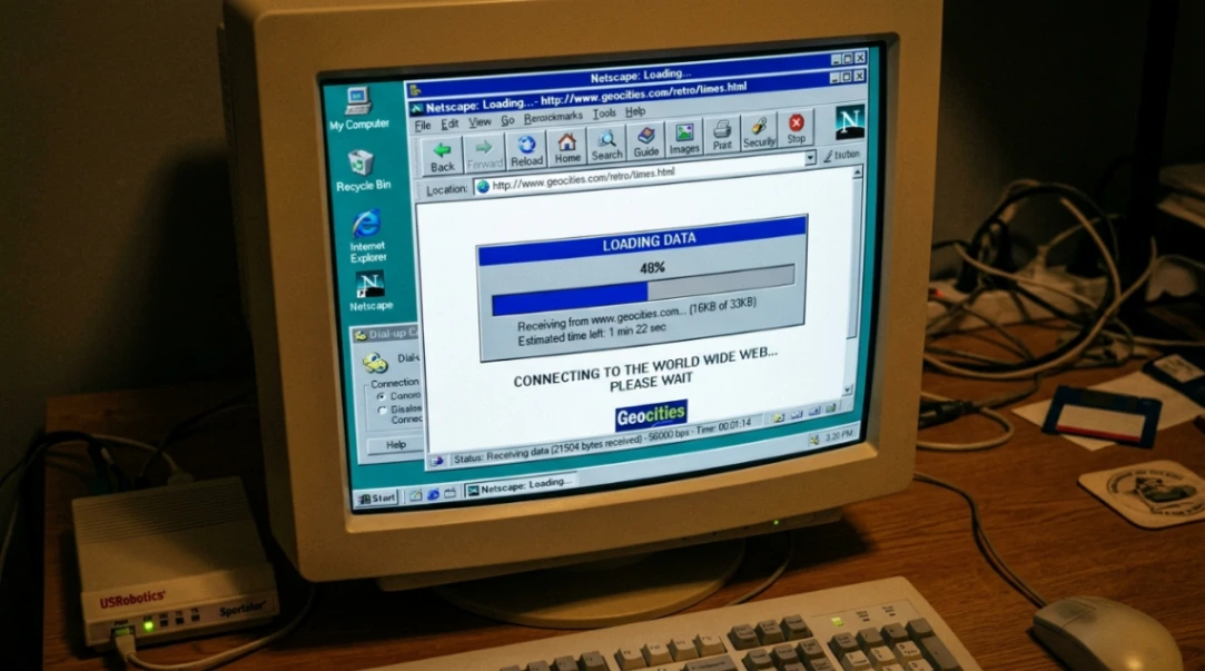
If you ever opened a webpage in 1998 and stared at a blank white screen for 30 seconds while your 56k modem screamed at you, you were a victim of the Table Layout Era.
Early web builders did something clever, a little reckless, and honestly kind of brilliant: they took an HTML element meant for spreadsheet-style data and turned it into the backbone of every visual layout on the internet. The result? A web that looked polished but was, underneath the hood, a structural disaster.
This is the story of how that happened, why it mattered, and what it took to fix it.
What Were Web Builders Actually Working With?
To appreciate the chaos, you have to understand the starting point.
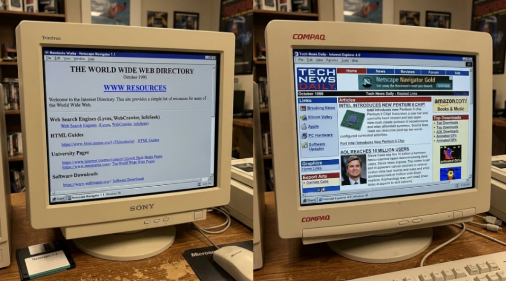
When Tim Berners-Lee launched the first website in August 1991, it was purely text. No images. No columns. No sidebars. Just headings, paragraphs, and hyperlinks. The browser was meant to be a "user agent" that adapted content to whatever screen was in front of it.
Then Mosaic launched in 1993, Netscape Navigator followed in 1994, and suddenly the web had images. But layout control? Basically zero. Everything flowed vertically in a single column, shaped entirely by the browser window.
By the time businesses like Amazon (1995) started building storefronts, they wanted the kind of multi-column, branded layouts you'd see in a print catalog. And HTML had nothing for them, except one accidental workaround.
The <table> element.
| HTML Milestone | Date | Layout Impact |
|---|---|---|
| First Web Page | 1991 | Text only, no layout control |
| Mosaic Browser | 1993 | Images added, still single-column |
| HTML 3.2 | 1997 | Officially added <table> for data |
| HTML 4.0 | 1998 | Warned against table layouts; pushed CSS |
Why Web Builders Turned Tables Into a Layout Tool
Here's the thing: using <table> for layout wasn't in anyone's documentation. It was a survival strategy.
Designers in the mid-90s were trained on print. They expected pixel-perfect control. The <table> element, with its rows, columns, and cells, was the closest thing HTML had to a grid system. So they bent it to their will.
By nesting tables inside tables, early web builders could fake a three-column magazine layout. They used attributes like valign, cellpadding, and fixed width values in pixels to lock everything in place. It worked. Sort of.
The "spacer GIF" trick became part of the toolkit too. A 1x1 pixel transparent image, stretched to any width using HTML attributes, could push text exactly ten pixels to the right. Designers were, quite literally, using invisible pictures as margins.
The result was code bloat on a wild scale. A simple three-column layout could require hundreds of lines of <tr> and <td> tags just to hold the page together. Table-era markup for a basic header wrapper clocked around 150 bytes. The modern semantic equivalent? 25 bytes. For a full three-column grid: 450 bytes vs 60 bytes today.
On a 28.8k dial-up connection, that difference was measured in seconds of staring at nothing. Browsers wouldn't render the page until they recieved the closing </table> tag, so users got the infamous "white screen" experience while the whole structure downloaded first.
Tools like Microsoft FrontPage and Macromedia Dreamweaver automated this process, but often made things worse by generating even more redundant, bloated table code than a human coder would produce by hand.
David Siegel and the "HTML Terrorism" Playbook
No single person shaped this era more than David Siegel.
His 1996 book, Creating Killer Web Sites, was the first real design manual for the web. Siegel sorted web evolution into three generations, and "third-generation" sites were defined by visual ambition, real-world metaphors, and precise layout control.
To get there, he openly advocated "HTML terrorism": using any hack necessary to override the browser's defaults. Tables, spacer GIFs, invisible borders, Netscape-optimised workarounds. If it worked visually, it was valid.
This philosophy influenced an entire generation of web builders to treat HTML as a canvas rather than a document structure. The markup became, as the W3C later put it, "meaningless markup" — code that described position, not content.
For more on how WYSIWYG tools accelerated this problem, check out the full Dreamweaver vs FrontPage story. Those tools auto-generated even messier table code than humans wrote by hand, and the rivalry between them shaped how an entire generation thought about web building.
How Tables Broke Accessibility (This Part Gets Dark)
The code bloat and slow load times were annoying. But this is the part where the table layout era caused real harm.
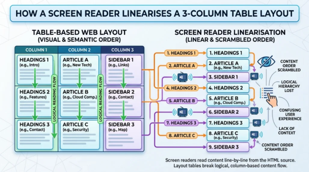
Screen readers like JAWS, released for Windows in 1995, read HTML linearly, row by row, cell by cell. In a data table, that makes sense. In a layout table, it's a disaster.
Imagine a three-column portal page from 1998. The second row of the master table would contain: the first cell of the sidebar, the first cell of the main article, and the first cell of the right-hand ad. A screen reader would read them in that order. One sentence of the sidebar, then one sentence of the article, then a "Buy Now" prompt. The content became a completely incoherent jumble.
| Element | Sighted Experience | Screen Reader Experience |
|---|---|---|
| Sidebar | Navigation links on the left | Jumbled between content fragments |
| Main Article | Dominant text in centre | Interrupted by sidebar/ad text |
| Advertisement | Clearly separated on right | Appears mid-sentence in content flow |
The Web Content Accessibility Guidelines (WCAG), first published in 1999, explicitly warned against using tables for layout. The design community mostly ignored it.
The Browser Wars Made Everything Worse
While all this was happening, Netscape and Microsoft were locked in a war for browser dominance, and both were inventing proprietary HTML tags to win users over.
Netscape pushed <blink>, <layer>, and <multicol>. Microsoft countered with <marquee> and its own CSS flavour. A page built for Netscape 3.0 would regularly break in Internet Explorer 3.0. Developers responded with "browser sniffing" scripts: primitive JavaScript that detected your browser and redirected you to a different version of the site.
This added roughly 25% to development costs and split the web into isolated pockets of content behind "Best Viewed In..." badges. It was fragmented, expensive, and unsustainable.
CSS1 was released by the W3C in December 1996 as the solution, but early browser support was so buggy and inconsistent that tables remained the only reliable choice for layout. You can trace some of this chaos back even further. Tools like ADF (Actual Drawing Framework) were already experimenting with visual web building before the standards existed to support it properly. And the no-code tools of the Geocities and Angelfire era were training a whole generation of builders to prioritise personalisation over structure.
The Shift Away: WaSP, CSS, and Wired's Big Moment
By 1998, the situation had become a genuine crisis. In August of that year, developers George Olsen, Glenn Davis, and Jeffrey Zeldman founded the Web Standards Project (WaSP), a grassroots coalition dedicated to pressuring browser makers to follow W3C specifications.
WaSP's "CSS Samurai" created the Acid1 test in October 1998: a simple CSS-only page that rendered a specific graphic if the browser handled standards correctly. At launch, every single browser failed. That test became a benchmark that browser engineers actually competed to pass.
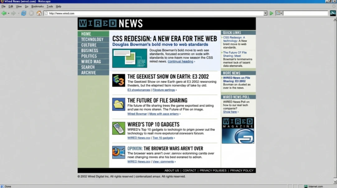
The pivotal proof of concept came on October 11, 2002, when Wired News launched a full redesign by design director Doug Bowman. It was the first major high-traffic publication to abandon tables entirely. Page weight dropped dramatically, accessibility improved, and search engines could actually index it properly.
Zeldman and Eric Meyer called it the high-profile redesign the web standards movement had been waiting for. ESPN and Fortune.com soon followed.
It's worth noting that some of the earliest WYSIWYG web builders had already been pushing toward visual simplicity years before this shift. The WebMagic story from 1995 shows just how early that instinct appeared, even if the standards infrastructure wasn't ready to support it yet.
The Living Fossil: Why Email Still Uses Tables in 2025
Here's the punchline that proves the table era never fully ended.
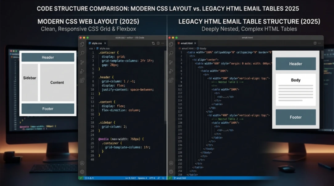
HTML email developers in 2025 still use deeply nested tables and inline CSS. Why? Because Microsoft Outlook, in a genuinely legendary blunder in 2007, swapped its rendering engine from Internet Explorer to Microsoft Word. Word is designed for fixed-size paper. It has no concept of float, flexbox, or absolute positioning.
So every marketing email you send has to be built with the same 1990s table hacks David Siegel was championing in 1996, or it falls apart in your recipient's inbox.
Litmus estimates the email rendering landscape spans approximately 15,000 different client, device, and version combinations. In that environment, the humble <table> is still the only universal fallback that works predictably across all of them.
| Constraint | Modern Web | HTML Email (2025) |
|---|---|---|
| Primary Structure | <div> / semantic tags | <table> |
| CSS Placement | External stylesheets | Inline style attributes |
| Layout Method | CSS Grid / Flexbox | Nested tables |
| Max Width | Variable / fluid | Fixed (~600px) |
It's a cautionary tale: once a hack becomes infrastructure, it can take decades to dislodge.
Start exploring launch-ready no-code templates here!
Key Takeaways
The Table Layout Era (roughly 1994 to 2002) is one of the web's most fascinating case studies in unintended consequences. Early web builders weren't being malicious. They were being resourceful. The <table> element was the only grid-like structure HTML offered, and they used it to make the web visually competitive with print media.
But the costs were real: code bloat that made pages slow on dial-up, an accessibility crisis that made the web nearly unusable for screen reader users, and browser fragmentation that split the internet into incompatible pockets of content.
It took a grassroots standards movement (WaSP), a high-profile proof-of-concept (Wired News, 2002), and years of browser-maker pressure to course-correct. The philosophical shift, from treating the web as a fixed print canvas to embracing its fluid, accessible nature, is best summarised by John Allsopp's 2000 essay A Dao of Web Design, which laid the groundwork for everything from CSS layouts to modern responsive design.
The lesson for anyone building on the web today: structural integrity and accessibility aren't constraints on creativity. They're what makes creativity last.
FAQ
Why did early web builders use tables for layout? HTML lacked native grid or column support until CSS matured. Tables offered rows and columns that designers could repurpose for visual layouts, making them the only practical option for multi-column designs in the mid-1990s.
What was the spacer GIF trick? A 1x1 pixel transparent image stretched via HTML width and height attributes to create invisible spacing between elements. It was essentially a fake margin before CSS margins were reliably supported by browsers.
How did table layouts affect accessibility? Screen readers linearise tables row by row, scrambling content from sidebars, articles, and ads into one incoherent stream. This made table-based pages nearly impossible to navigate for blind users.
Who founded the Web Standards Project (WaSP)? George Olsen, Glenn Davis, and Jeffrey Zeldman founded WaSP in August 1998 to pressure browser makers into following W3C standards and end the fragmentation of the early web.
Why do HTML emails still use tables in 2025? Microsoft Outlook switched its rendering engine to Microsoft Word in 2007, which lacks support for modern CSS layout. Tables remain the only reliable cross-client structure across roughly 15,000 rendering environments.
Build it without code
Browse thousands of free no-code website templates for Webflow, Framer, Bubble and more.
Explore Free Templates